Expander
<ns-expander> 
Overview
A component to show and hide content related to heading.
An expander consists of a heading and an anonymous content slot. Click on a heading to reveal the content. Click it again to hide the content.
Use an ns-expander component in an accordion, a product card, or other contexts.
Examples
Guidance
Standard
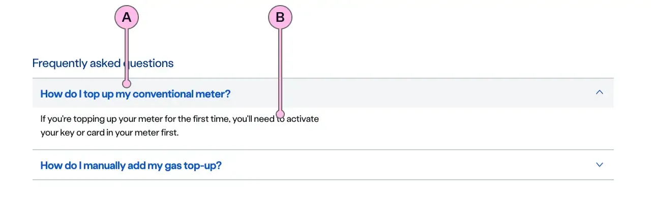
Key
| Key | Field type | Guidelines |
|---|---|---|
| A | Heading | The heading is there to introduce the content placed in the expander’s anonymous slot. When the heading is clicked the component opens to reveal the content. |
| B | Content | The content can accommodate sub headings, lists and paragraphs. It should be concise. Divide content into short paragraphs as it’s easier to consume and aids effective page scanning. Content can contain bold copy <b> <strong>, inline links <a>, lists <ul> <ol>, and a caveat at the end of the relevant paragraph if required <a href="#caveat">1</a>. |
Implementation
Placement
The ns-expander component can be used in the following components:
Specification
Attributes
colour
- Property
colour- Description
- The colour of the expander.
- Type
yellow- Default
icon
- Property
icon- Type
string- Options
- Refer to our icons.
- Default
open
- Property
open- Description
- Whether the expander is open.
- Type
boolean- Default
false
type
- Property
type- Description
- The type of the expander.
- Type
string- Options
standardskyline- Default
standard
Slots
| Slot | Permitted tags | Description |
|---|---|---|
heading | <h3> <h4> | The heading of the expander. |
| Anonymous slot | <p> | Anonymous slot for content. |
Events
| Name | Description |
|---|---|
expander-toggle | Dispatched when the expander is toggled. |
Last updated: