Highlighter
<ns-highlighter> Deprecated 
Overview
Highlighter can be used to communicate error, info, success and warning messages.
The ns-highlighter communicates messages that a service may not be available or that there are technical issues on specific pages. These differ from global messages as they only apply to some pages and are not site-wide. e.g. A message that says the top-up service may not be available would only apply to pages that customers will look at to top up.
Examples
Guidance
Standard
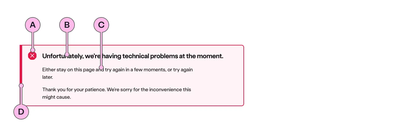
Key
| Key | Field type | Guidelines |
|---|---|---|
| A | Icon | This is the icon inside the Highlighter. This is dictated by the type of Highlighter. The specification has a list of options. |
| B | Heading | The recommended length is between 4 and 12 words, not exceeding 50 characters in total. |
| C | Content | A single, short paragraph works best. You are able to use inline text links within the paragraph if necessary. Don’t add additional headings within the paragraph and the copy length should not exceed more than two paragraphs of 3 lines each. Can contain bold copy <b>, inline links <a>, and a caveat at the end of the relevant paragraph if required <a href="#caveat">1</a>. |
| D | Accent | This is to support the context of the messaging. This colour matches that of the icon. |
Implementation
Placement
The ns-highlighter component can be used in the following components:
<ns-form><div>wrapped in<ns-panel>
Specification
Attributes
type
- Property
type- Description
- The type of the highlighter.
- Type
string- Options
errorinfosuccesswarning- Default
error
Slots
| Slot | Permitted tags | Description |
|---|---|---|
heading | <h2> <h3> | The heading of the highlighter. |
| Anonymous slot | <p> <div> | Anonymous slot for content. |
Last updated: