Panel
<ns-panel> 
Overview
Panel is a decorative empty container that holds each section of a page.
It provides an area to place a layout, add an optional decoration and apply the appropriate margins. There can be more than one ns-panel on a page.
Examples
Guidance
Standard
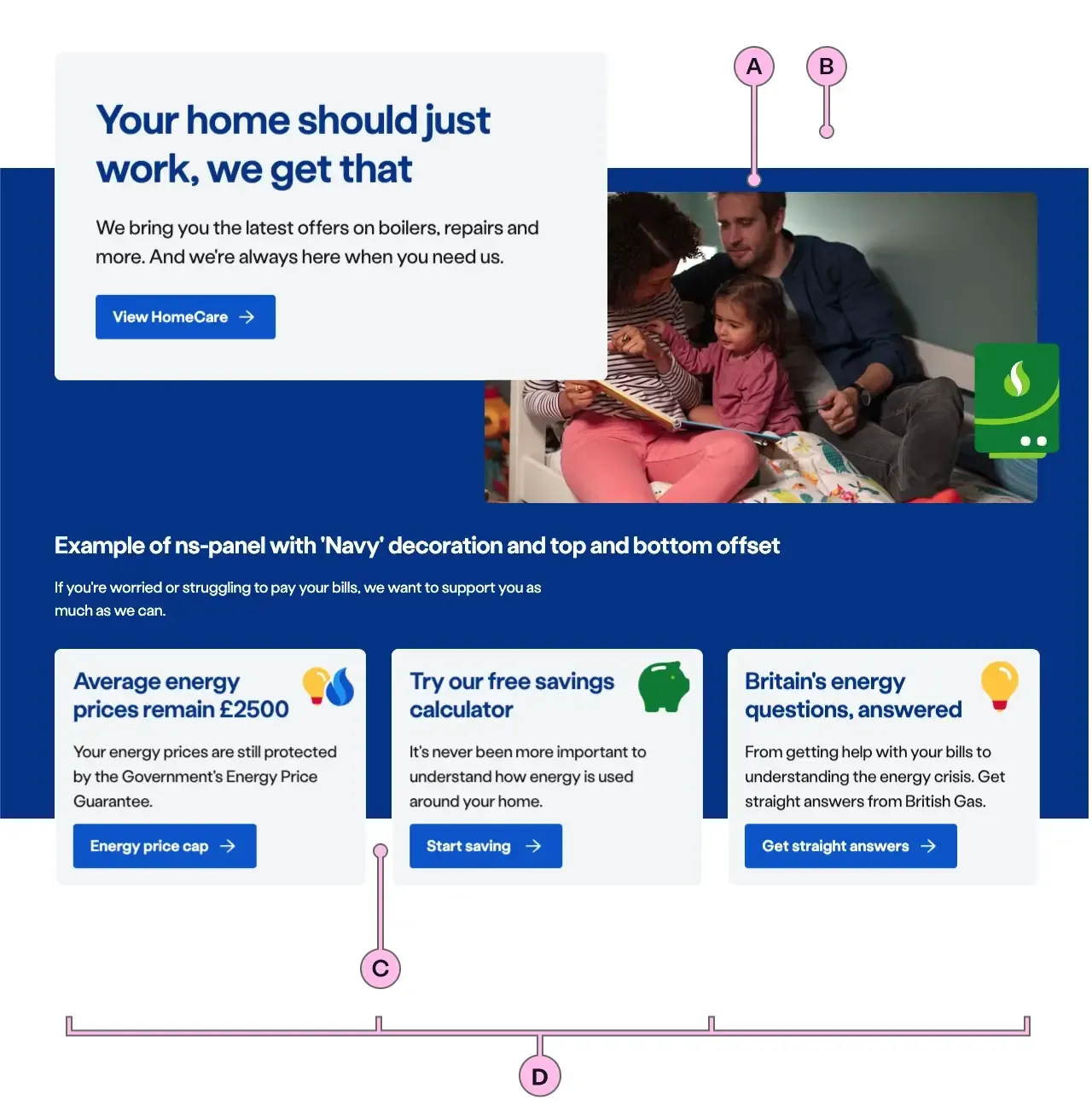
Key
| Key | Field type | Guidelines |
|---|---|---|
| A | Decoration | Choose between a no-colour background (default) or one of the available brand colours. |
| B | Top offset | Adjust the vertical space which can affect where the decoration starts at the top. |
| C | Bottom offset | Adjust the vertical space which can affect where the decoration ends at the bottom. |
| D | Columns | Use <ns-column> to define a multi column layout. |
Implementation
Placement
The ns-panel component can be used in the following components:
<main><ns-tabs>
Specification
Attributes
decoration
- Property
decoration- Description
- The decoration background of the panel.
- Type
string- Options
cyanlimenavyblueforestorangeredyellowwhitegrey-light- Default
type
- Property
type- Type
string- Default
panel
Slots
| Slot | Permitted tags | Description |
|---|---|---|
| Anonymous slot | <div> <ns-column> <ns-content> <ns-lockup> | Anonymous slot for content. |
Last updated: